This post will show you how to easily add a simple and responsive image gallery to your Blogger/Blogspot blog.
Galleries are a great way to display multiple images without making the user scroll through a long slow-loading page. This tutorial will show you how to add an image gallery in a grid layout with rows and columns.
You could use an image gallery to add a portfolio, project gallery, recipe gallery or a visual archive page that links to separate posts on your blog. You could also add a gallery within separate posts to showcase a collection of images such as travel photography, external products, shop this post or lookbook items.
How to add a simple and responsive image gallery to Blogger
On Blogger, go to Theme > Edit HTML and find the CSS section of your theme (between <b:skin> and ]]> </b:skin>). You’re going to add the CSS above the closing ]]> </b:skin> tag.
Related: How to find and edit code in your Blogger theme
Style your image gallery with CSS
Paste the following right above ]]> </b:skin>
/* START SIMPLE RESPONSIVE GALLERY XOMISSE */
.gallery {
padding: 0 5px;
float: left;
width: 24.99999%;
}
div.gallery img {
width: 100%;
height: auto;
}
div.gallery img:hover {
opacity: 0.8;
}
div.desc {
padding: 10px;
text-align: center;
}
* {
box-sizing: border-box;
}
@media only screen and (max-width: 700px){
.gallery {
width: 49.99999%;
margin: 6px 0;
}
}
@media only screen and (max-width: 500px){
.gallery {
width: 100%;
}
}
.image-gallery:after {
content: "";
display: table;
clear: both;
}
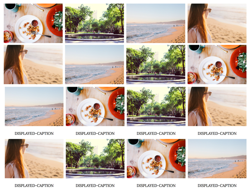
/* END SIMPLE RESPONSIVE GALLERY XOMISSE */This styles the images and captions in a grid format, as well as making it responsive (go from 4 columns to 2 columns to 1 column depending on screen size). Customise this CSS as you wish.
Want a 3 column grid instead? Change the width value on .gallery to 33.333% instead.
Build your image gallery with HTML
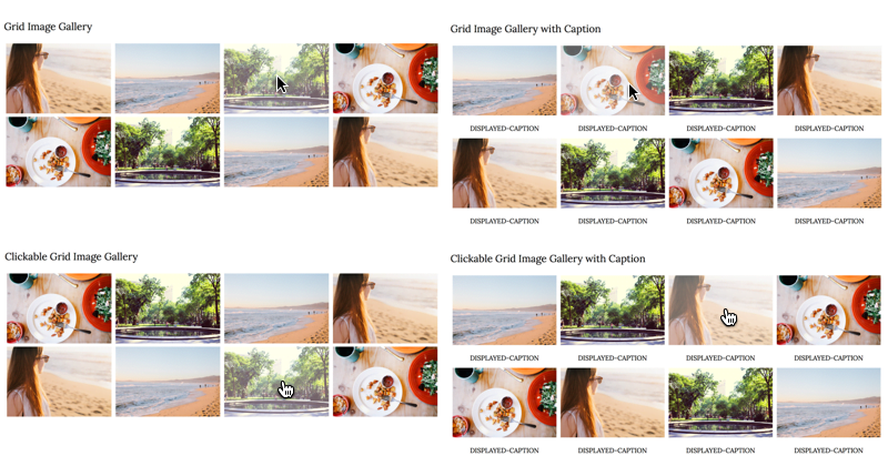
There are four style options depending on if you want a standard image gallery with/without captions or a clickable gallery, with/without captions, that links to other posts, pages or external sites.
To add the gallery to a post, page or gadget, copy and paste the following HTML. It’s important that you make sure you’re pasting it in HTML mode (not compose/rich text mode) and don’t switch between modes once you paste it, otherwise Blogger will add code between the lines and break the structure.
<div class="image-gallery">

  <!-- Grid Image Gallery -->
  <div class="gallery">
      <img src="IMAGE-URL" alt="SEO-IMAGE-CAPTION">
  </div>

  <!-- Grid Image Gallery with Caption -->
  <div class="gallery">
      <img src="IMAGE-URL" alt="SEO-IMAGE-CAPTION">
      <div class="desc">DISPLAYED-CAPTION</div>
  </div>

  <!-- Clickable Grid Image Gallery -->
  <div class="gallery">
    <a href="LINK" target="_blank">
      <img src="IMAGE-URL" alt="SEO-IMAGE-CAPTION">
    </a>
  </div>

  <!-- Clickable Grid Image Gallery with Caption -->
  <div class="gallery">
    <a href="LINK" target="_blank">
      <img src="IMAGE-URL" alt="SEO-IMAGE-CAPTION">
    </a>
    <div class="desc">DISPLAYED-CAPTION</div>
  </div>

</div>
Now upload your images and replace IMAGE-URL with the direct image URL.
Related: How to host images directly on Blogger
Replace LINK with the post, page or external site you want that image to link to. Replace SEO-IMAGE-CAPTION and DISPLAYED-CAPTION with an SEO friendly descriptive caption.
Related: How to SEO your posts on Blogger
To add more images, simply copy and paste the block of Grid Image code within the image-gallery div wrapper.
You can now save and publish your post or page. Your image gallery should be displayed in a nice grid and be responsive when you change the browser screen size.