
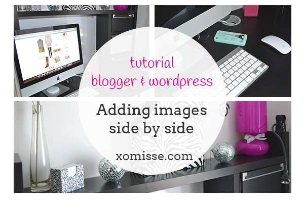
Todays tutorial will show you two ways of adding vertical images side by side and making them align correctly with a horizontal image. I go through how to do this on Blogger, but you can also do it on WordPress using the same code. An example of the layout is shown below also. This is very popular with fashion bloggers who like to show photos of the full outfit and detail photos.
Heads up! This post is no longer being updated, so some details may be out of date.
Fixing the Spaces between Images on Blogger
- Firstly, follow this tutorial on how to remove the space between images on Blogger. This will make everything look neater and sit together better by remove excess spaces.
- Now go to Template > Edit HTML and just before
</b:skin>add the following code. The first line alters the max width your images will appear. The second line helps define your post-body size, so the width of your content. These will just make sure that the images line up.
.post-body img { max-width: WIDTHpx !important; }
.main-inner .column-center-inner .section { width: WIDTHpx !important; }
Here is a tutorial on how to automatically resize post images to fit blog post area.
METHOD 1 – Adding images side by side Blogger & WordPress
1. Upload your images to a hosting site, like Photobucket. When adding images vertically like this on Blogger, it’s best to use an alternative image hosting. Start a new post. Click the HTML tab on Blogger or Text tab on WordPress and add the following code.
<img src="IMG 001" width="WIDTHpx" /> <img alt="" src="IMAGE 002" width="WIDTHpx" />
<img alt="" src="FULL IMAGE URL 003" />
or if you don’t want a gap in between the images, use this code without the space.
<img src="IMG 001" width="WIDTHpx" /><img alt="" src="IMAGE 002" width="WIDTHpx" />
<img alt="" src="FULL IMAGE URL 003" />
2. The first line is for two vertical images, enter the direct URL from Photobucket. You will need to define the width of them to make them side by side. There will be a space in between (about 10-12px) so you’ll want to include that when calculating. The second line is for your normal horizontal images. You don’t need to define a size here, especially if you did step 2, but you can if you want to ensure they line up correctly. To add the width just add width="WIDTHpx" before the closing /> like in the first line.
3. Then click back to the Compose or Visual and start writing your blog post.
An Example of vertical & horizontal images
<img src="URL" width="276px"> <img alt="" src="URL" width="276px" />
<img alt="" src="URL" width="560px" />
METHOD 2 – Use Tables to add vertical images side by side
This is an alternative but very similar way of adding vertical image side by side. The use of tables allows you to add more code in order to customise it. It’s an older HTML way. I’ll talk about tables in more detail in a future post.
<table>
<tbody>
<tr>
<td><img alt="DESCRIPTION" src="DIRECT IMAGE URL 1" width="WIDTHpx" /></td>
<td><img alt="DESCRIPTION" src="DIRECT IMAGE URL 2" width="WIDTHpx" /></td>
</tr>
</tbody>
</table>