Many blogs and websites, including my own, feature “hover over” effects on images where the image changes somehow when the mouse hovers over it. “Hover over” can also be referred to as rollover or mouseover. Usually, javascript coding is used to create this effect but there are some easier and more efficient alternatives. I’ve mentioned method 1 in previous tutorials but I thought I should dedicate a post to it and show you how to work with this technique to add some cool features to your blog – use it on any images such as your header, social media icons, post images, etc.
Create your Images
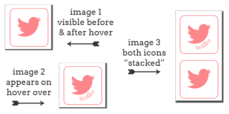
First thing you need to do is create your images, I recommend GIMP which is a free alternative to Photoshop. Create one and duplicate it. On the duplicate you can change the colour, add something extra or whatever you want. I will recommend keeping them both the same size as it just works better. If using method 2 you will also need to create a third blank image, in this image add your original two images. Place the image you want to appear first on the bottom and the hover over image on top.
Hover over effect method 1
You can add this to a blog post, page or gadget on your blog. For the gadget, go to Layout > Add HTML/Javascript Gadget and paste it there. For a post or page, create new and hit the HTML tab instead of compose mode, then paste the code. Fill in your own details.
<a href="WEBSITE URL HERE" target="blank" title="DESCRIPTION OF LINK/WEBSITE">
<img src="DIRECT URL OF IMAGE" border="0" onmouseover="this.src='DIRECT URL OF SECOND IMAGE WHEN HOVERED OVER'" onmouseout="this.src='DIRECT URL OF IMAGE'" />
</a>
Hover over effect method 2
Method 2 uses only CSS code. It is popular because we only use one image (image #3 from above example) meaning it loads faster.
- Add the following HTML to your blog. You can add it to a blog post, your HTML Template or a HTML gadget. If using multiple images add it multiple times. Instead of
hoverexampleyou could usetwitterimage,facebooklinkor whatever you want as long as it is the same as the CSS we will add below.<a class="hoverexample" href="WEBSITE URL">Title of Link</a> - Now we need to add CSS code to your blog. In Blogger, go to Template > Customise > Advanced > Add CSS. In WordPress, add the following to your themes stylesheet.
.hoverexample {
display: block;
float: left;
width: 150px; /* adjust this depending on your image */
height: 70px; /* adjust this depending on your individual images */
background: url('DIRECT IMG URL OF THIRD IMAGE CREATED') bottom;
text-indent: -99999px;
margin-right: 5px; /* adjust for spacing between icons */
}

.hoverexample:hover {
background-position: 0 0;
}
If using multiple images (such as social media icons), you’ll need to add this code for each image/icon changing
.hoverexampleand.hoverexample:hoverfor each. You could use.twitterimage,.facebooklinkor whatever you want as long as it is the same as the HTML class we already added.
The Results of Method 1 and 2

“Fall in” Hover Over Effect
A cool extra effect which “rolls” the image in so it looks like it falls down or drops from above. Use method 2 and then add the following below margin-right: 5px; and before }
-webkit-transition: all ease 0.5s;
-moz-transition: all ease 0.5s;
-o-transition: all ease 0.5s;
-ms-transition: all ease 0.5s;
transition: all ease 0.5s;
so it looks like this
.hoverexample {
display: block;
width: 100px; /* adjust this depending on your image */
height: 100px; /* adjust this depending on your individual images (#1 and #2) */
background: url('DIRECT URL HERE') bottom;
text-indent: -99999px;
margin-right: 5px; /* adjust for spacing between icons */
-webkit-transition: all ease 0.5s;
-moz-transition: all ease 0.5s;
-o-transition: all ease 0.5s;
-ms-transition: all ease 0.5s;
transition: all ease 0.5s;
}

.hoverexample:hover {
background-position: 0 0;
}
The Result
Show me what you’ve created
Theres loads of ways to use this effect and so much you can do with it, if you do use it let me know. I’d love to see it.
Premade Social Media Icons
How to Add Social Media Icons to Your Blog